Baker Tilly
Baker Tilly is the name of a well known tax advisory network of big and small firms throughout the world. They came to us for a brand architecture, strategy and brand refresh which included a new logo and identity system.


The client had already adopted a brand promise “Now, for tomorrow” and preferred a symbol to work to unify all of their companies under a masterbrand strategy of some kind.

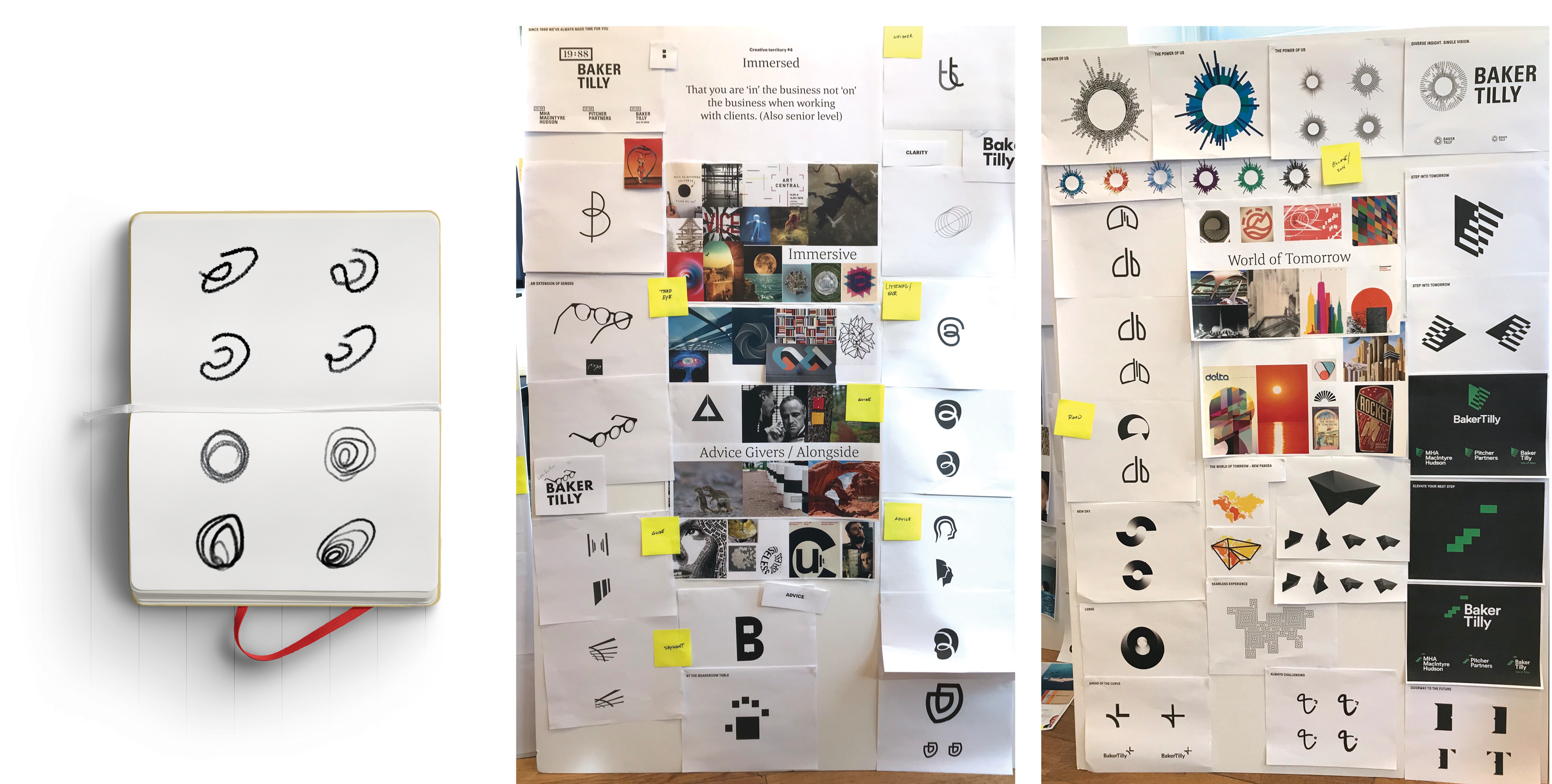
The idea of the ‘growth’ symbol originally came from a listening ear (for advisory). Later, it evolved into a more abstract shape that suggested other attributes like growth, immersion and even a portal to the future.

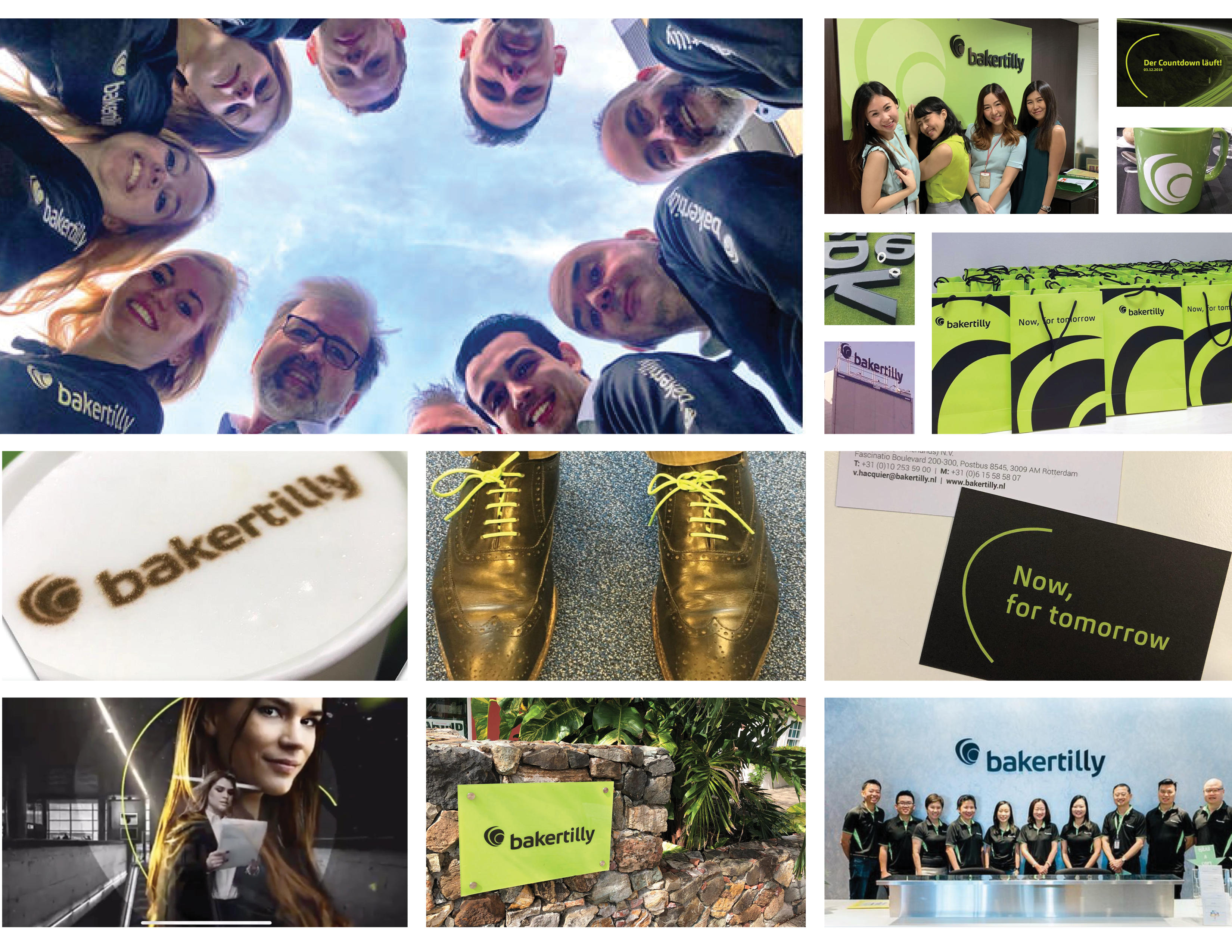
A visual device was also created for Baker Tilly titles and some headlines. This shape was derived from the curve of the logo. It suggests a message being communicated in confidence, conveying a feeling of trust.


By having a graphic trick like this on the front of communications, it added another level of brand ownership to communications.

As you can see, the brand assets — used together — could be used differently on the similar pieces, but Baker Tilly continues to look like a cohesive brand.

Similarly, since there was no budget for worldwide policing of the identity when we launched, we kept the kit just this basic. The only rule was for the memorable font, color, logo and sometimes-title-graphic to go on virtually everything.
When these tools went out across 165 firms in 143 territories to 6000 employees, some fascinating things happened.
But our favorite part of the Baker Tilly project was watching how grateful and eager the worldwide network was to emulate a new vision.

